Introduction
This vignette illustrates the potential visualizations (and the ensuing analysis) of traffic data from Telraam sensors provided by the package.
Before we go on, we’ll attach the packages we use.
We will also load the data: here, we will use the dataset attached to
the package, but you can certainly replicate these visualizations and
analyses using data from your own sensors. For more information on data
retrieval, you can refer to the dedicated vignette
(vignette("data-details")).
Included dataset is lazily loaded with the telraamStats package. If
you have already called library(telraamStats), the dataset
is already attached and you can call it directly :
head(traffic)| instance_id | segment_fullname | segment_id | date | interval | uptime | heavy | car | bike | pedestrian | heavy_lft | heavy_rgt | car_lft | car_rgt | bike_lft | bike_rgt | pedestrian_lft | pedestrian_rgt | direction | car_speed_hist_0to70plus | car_speed_hist_0to120plus | timezone | v85 | day | hour | weekday | holiday | vacation | segment_name | uptime_quality |
|---|---|---|---|---|---|---|---|---|---|---|---|---|---|---|---|---|---|---|---|---|---|---|---|---|---|---|---|---|---|
| -1 | 9000001844 - RteVitre-06 | 9000001844 | 2022-01-01 01:00:00 CET | hourly | 0 | 0 | 0 | 0 | 0 | 0 | 0 | 0 | 0 | 0 | 0 | 0 | 0 | 1 | 0, 0, 0, 0, 0, 0, 0, 0 | 0, 0, 0, 0, 0, 0, 0, 0, 0, 0, 0, 0, 0, 0, 0, 0, 0, 0, 0, 0, 0, 0, 0, 0, 0 | Europe/Paris | NA | 2022-01-01 | 1 | saturday | TRUE | Vacances de Noël | RteVitre-06 | FALSE |
| -1 | 9000001844 - RteVitre-06 | 9000001844 | 2022-01-01 02:00:00 CET | hourly | 0 | 0 | 0 | 0 | 0 | 0 | 0 | 0 | 0 | 0 | 0 | 0 | 0 | 1 | 0, 0, 0, 0, 0, 0, 0, 0 | 0, 0, 0, 0, 0, 0, 0, 0, 0, 0, 0, 0, 0, 0, 0, 0, 0, 0, 0, 0, 0, 0, 0, 0, 0 | Europe/Paris | NA | 2022-01-01 | 2 | saturday | TRUE | Vacances de Noël | RteVitre-06 | FALSE |
| -1 | 9000001844 - RteVitre-06 | 9000001844 | 2022-01-01 03:00:00 CET | hourly | 0 | 0 | 0 | 0 | 0 | 0 | 0 | 0 | 0 | 0 | 0 | 0 | 0 | 1 | 0, 0, 0, 0, 0, 0, 0, 0 | 0, 0, 0, 0, 0, 0, 0, 0, 0, 0, 0, 0, 0, 0, 0, 0, 0, 0, 0, 0, 0, 0, 0, 0, 0 | Europe/Paris | NA | 2022-01-01 | 3 | saturday | TRUE | Vacances de Noël | RteVitre-06 | FALSE |
| -1 | 9000001844 - RteVitre-06 | 9000001844 | 2022-01-01 04:00:00 CET | hourly | 0 | 0 | 0 | 0 | 0 | 0 | 0 | 0 | 0 | 0 | 0 | 0 | 0 | 1 | 0, 0, 0, 0, 0, 0, 0, 0 | 0, 0, 0, 0, 0, 0, 0, 0, 0, 0, 0, 0, 0, 0, 0, 0, 0, 0, 0, 0, 0, 0, 0, 0, 0 | Europe/Paris | NA | 2022-01-01 | 4 | saturday | TRUE | Vacances de Noël | RteVitre-06 | FALSE |
| -1 | 9000001844 - RteVitre-06 | 9000001844 | 2022-01-01 05:00:00 CET | hourly | 0 | 0 | 0 | 0 | 0 | 0 | 0 | 0 | 0 | 0 | 0 | 0 | 0 | 1 | 0, 0, 0, 0, 0, 0, 0, 0 | 0, 0, 0, 0, 0, 0, 0, 0, 0, 0, 0, 0, 0, 0, 0, 0, 0, 0, 0, 0, 0, 0, 0, 0, 0 | Europe/Paris | NA | 2022-01-01 | 5 | saturday | TRUE | Vacances de Noël | RteVitre-06 | FALSE |
| -1 | 9000001844 - RteVitre-06 | 9000001844 | 2022-01-01 06:00:00 CET | hourly | 0 | 0 | 0 | 0 | 0 | 0 | 0 | 0 | 0 | 0 | 0 | 0 | 0 | 1 | 0, 0, 0, 0, 0, 0, 0, 0 | 0, 0, 0, 0, 0, 0, 0, 0, 0, 0, 0, 0, 0, 0, 0, 0, 0, 0, 0, 0, 0, 0, 0, 0, 0 | Europe/Paris | NA | 2022-01-01 | 6 | saturday | TRUE | Vacances de Noël | RteVitre-06 | FALSE |
Period availability for your segments
Road segment-specific sensors do not operate continuously; they are limited by daylight duration and may also face other external issues (being unplugged, falling, software problems, etc.). The data collected during a period may not be continuous and could have interruptions ranging from an hour to several days.
To visualize traffic, it is important to be aware of the operating periods of the sensors being analyzed, as well as the quality of their data. The data reliability is provided through the uptime indicator. Uptime, ranging from 0 to 1, corresponds to the percentage of time during which the camera is actively counting passages. Following Telraam’s recommendations, here an uptime lower than 0.5 is considered associated with poor-quality data.
The graphical representation below, obtained using the
gg_availability() function, provides an overview of data
availability and quality for different sensors over the entire period.
This indicator is calculated over daytime hours (between 5 a.m. and 8
p.m.) when the Telraam sensor is operational. It represents the average
uptime during these hours. It illustrates the daily average uptime
evolution: the higher this value, the better the data quality for that
sensor on the respective day. Its purpose is to assist you in selecting
study periods.
plot(
  gg_availability(traffic)
)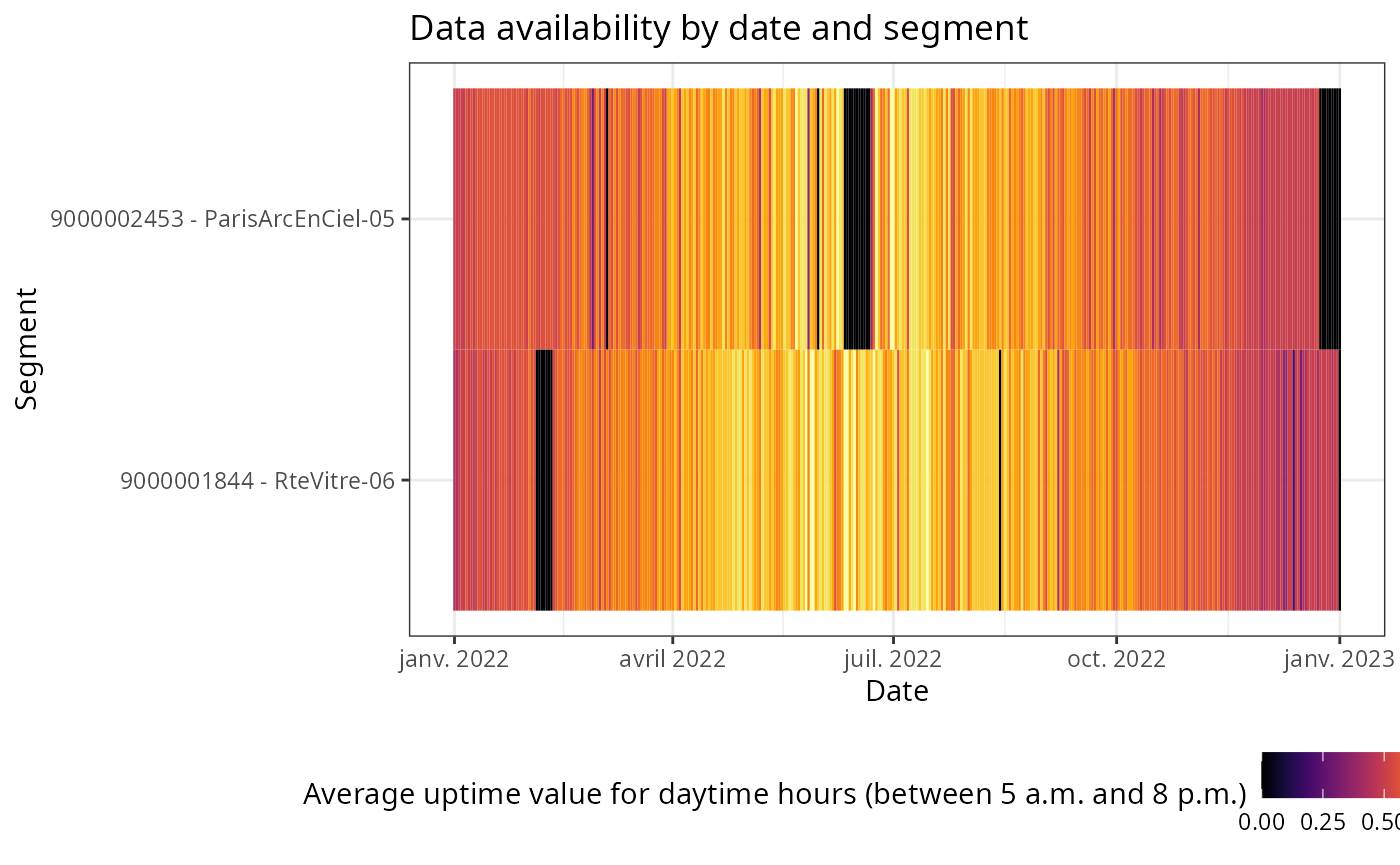
On this graph, for example, we can observe through black time slots that the camera on the segment ‘ParisArcEnCiel-05’ did not report any data at the end of June 2022 and at the end of the year 2022. We can also notice that the average uptime is higher during the summer period. This illustrates the fact that the duration of daylight, and therefore the possible filming period, is longer in summer.
All the graphs generated from the functions presented below
are based on data filtered according to this uptime
parameter: only hours with an uptime > 0.5 are retained.
This filter is not editable at the moment and ensures that the data
considered have a sufficient level of reliability.
Traffic
Traffic evolution
Once you have identified the specific period you want to analyze, you
may want to observe the evolution of traffic trends over time.
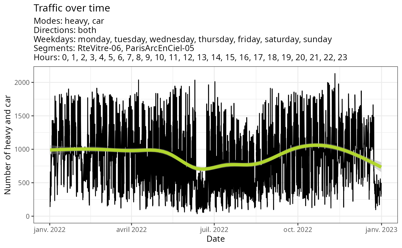
gg_traffic_evolution() enables the representation of
traffic for a particular period, aggregated for all or some segments,
for a specific direction, or aggregated for both, and aggregated for all
transportation modes or for selected ones.
Without specifying any options, you can view the traffic evolution of cars and heavy vehicles for all segments over the entire period. By default, a smoothing curve (based on a GAM model with cubic spline) is used to represent the trend.
plot(
  gg_traffic_evolution(traffic)
)
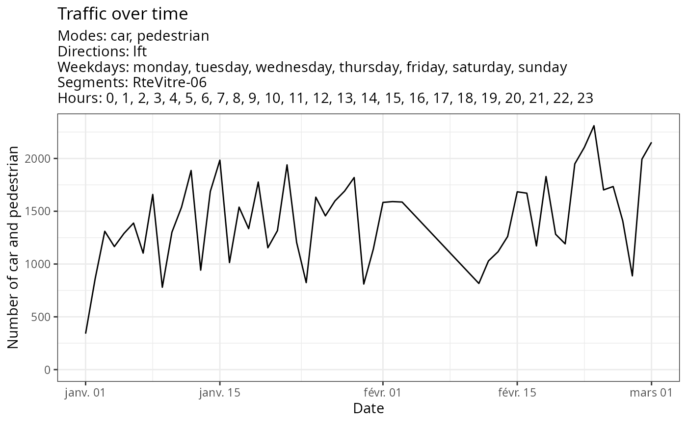
You can specify a date range, one or more segments, different
transportation modes or directions and choose whether you want a
smoothing curve or not. By default, the aggregation is done by day, but
you can obtain more precise information by setting the
agg_day parameter to FALSE to aggregate by
hour.
Below is an example of all these possible filters and parameters :
plot(
  gg_traffic_evolution(traffic,
                       date_range = c('2022-01-01','2022-03-01'),
                       segment = 'RteVitre-06',
                       mode = c('car','pedestrian'),
                       direction = 'lft',
                       smoothed = FALSE,
                       agg_day = FALSE)
)
Average traffic
Average traffic per weekday
The traffic varies according to the days of the week, which can serve
as an analytical window to understand territorial mobility. The
gg_traffic_avg() function allows to examine the average
behavior per day of the week. It can be used globally or more
specifically (over a specific period, on a segment or set of segments,
for a specific direction, for a particular transportation mode).
By default, this function provides the average traffic per day of the week :
plot(
  gg_traffic_avg(traffic)
)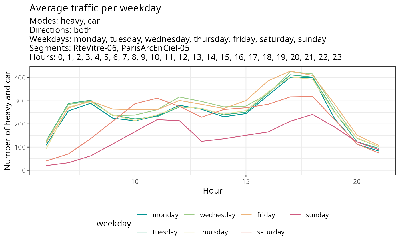
Here, for instance, one can observe several different traffic dynamics, with weekdays exhibiting similar patterns and weekends displaying different ones (such as a shifted morning peak and smoother traffic throughout the day).
As before, it’s possible to select a specific period, a specific segment, a mode of transportation, a direction, or a day of the week according to the needs of your study.
plot(
  gg_traffic_avg(traffic,
                 date_range = c('2022-07-01','2022-09-01'),
                 segment = 'RteVitre-06',
                 mode = 'car',
                 direction = 'rgt',
                 weekday = c('monday','friday')
                 )
)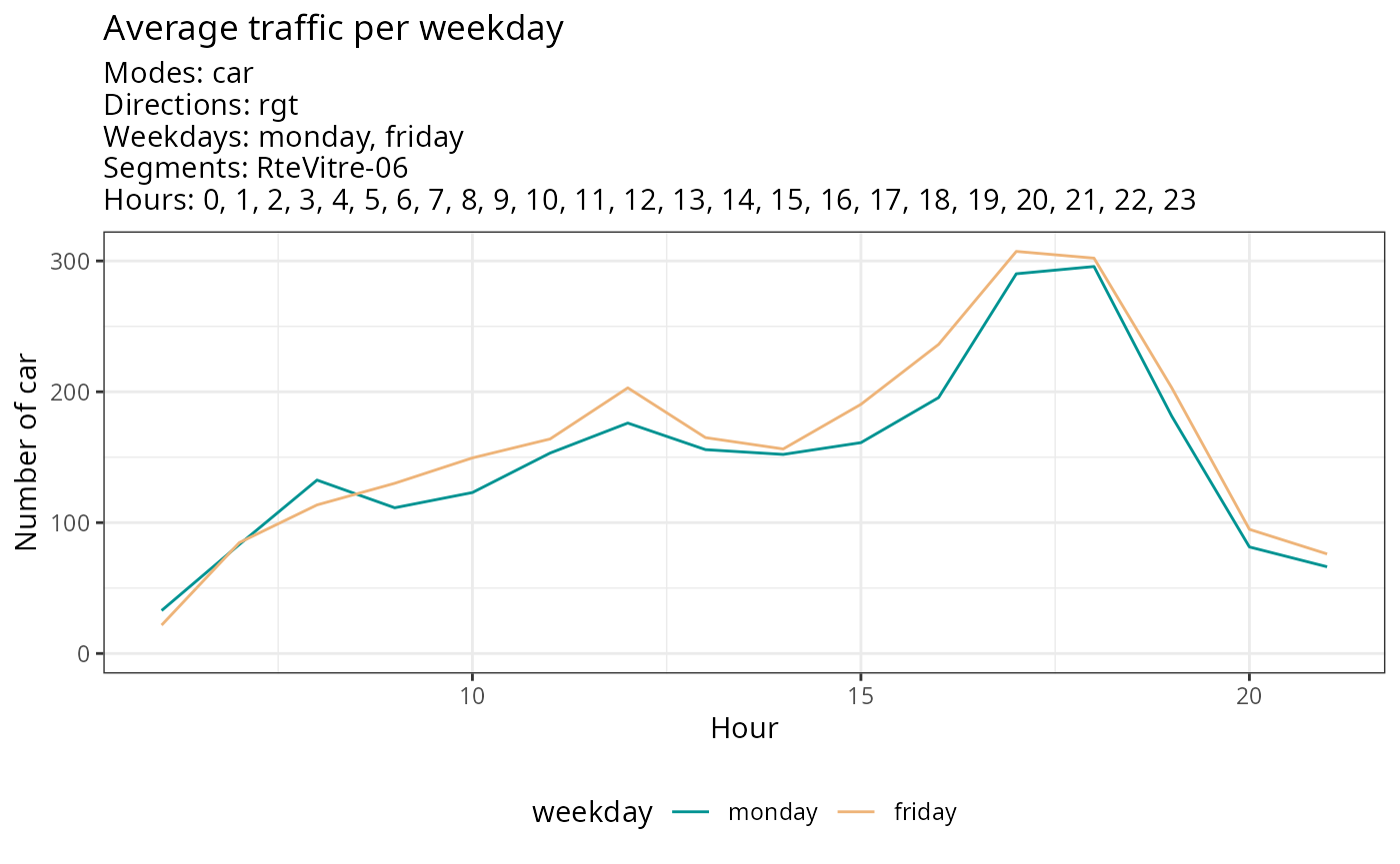
This representation, for instance, allows us to see that the traffic in one direction on this segment is much heavier in the evening than in the morning, and even more so on Fridays compared to Mondays.
Average traffic per segment
The same function gg_traffic_avg() can be used to
calculate the average traffic per segment and compare segments with each
other. To do this, simply use the parameter 'aggregated_by'
and replace the default value ('weekday') with
'segment_name', as shown in the example below. The function
will then plot the average traffic according to the time of day, but
this time by road segment.
plot(
  gg_traffic_avg(traffic,
                 aggregated_by = "segment_name")
)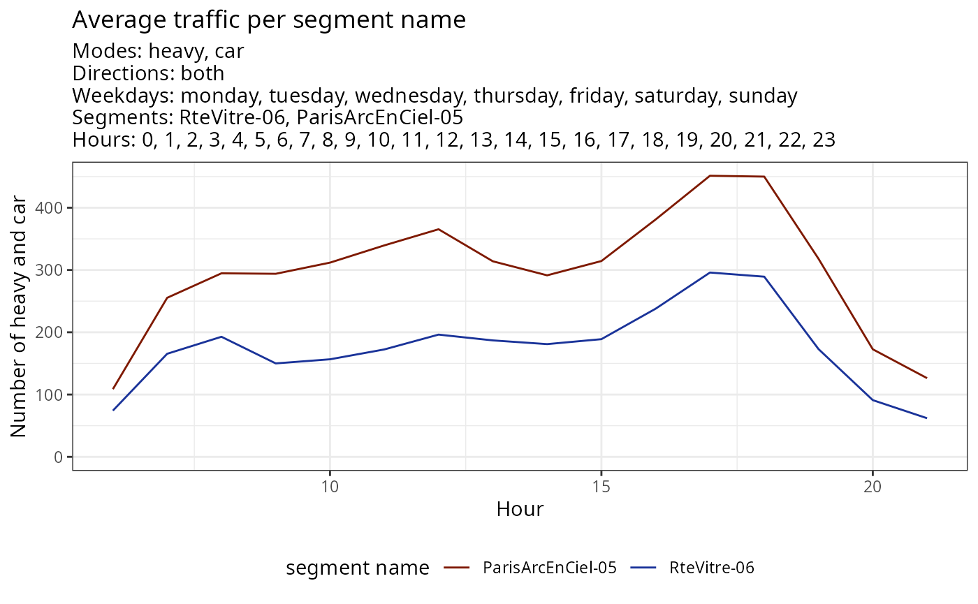
This representation allows us to realize differences in traffic, both in terms of volumes and dynamics.
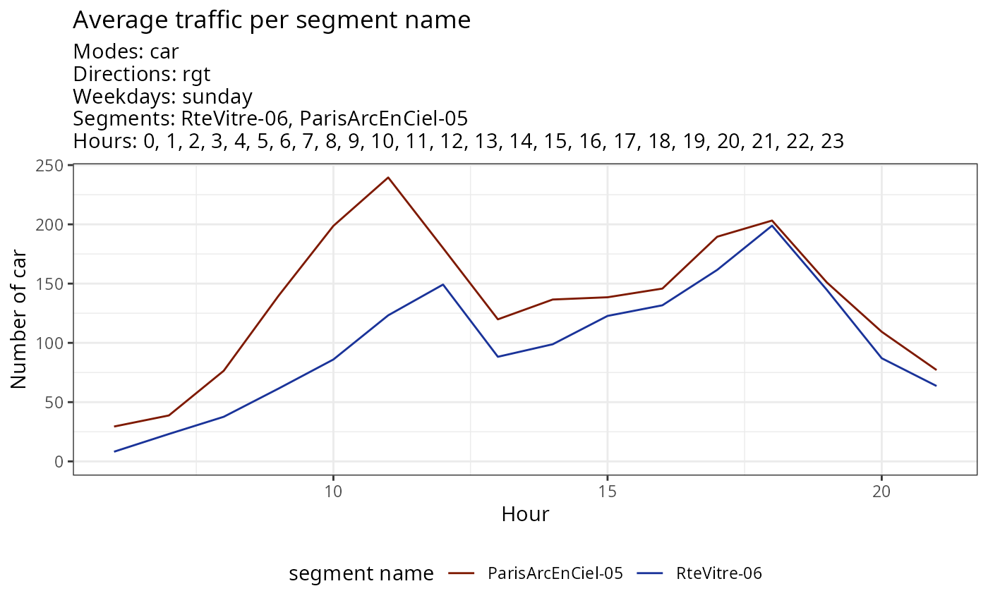
Similarly to before, it is possible to specify a period, a direction of travel, a mode of transportation, or here a day of the week.
plot(
  gg_traffic_avg(traffic,
                 aggregated_by = 'segment_name',
                 weekday = 'sunday',
                 mode = 'car',
                 direction = 'rgt')
)
Average traffic per direction
This function gg_traffic_avg() can also be used to
compare directions of travel, using the parameter
aggregated_by = "direction" as shown in the example below.
This can be particularly useful within the same road segment to observe
commuter traffic. As before, it is still possible to filter by modes of
transportation, days of the week, or segments.
plot(
  gg_traffic_avg(traffic,
                 aggregated_by = 'direction',
                 weekday = 'monday',
                 mode = 'car',
                 segments = 'RteVitre-06'
                 )
)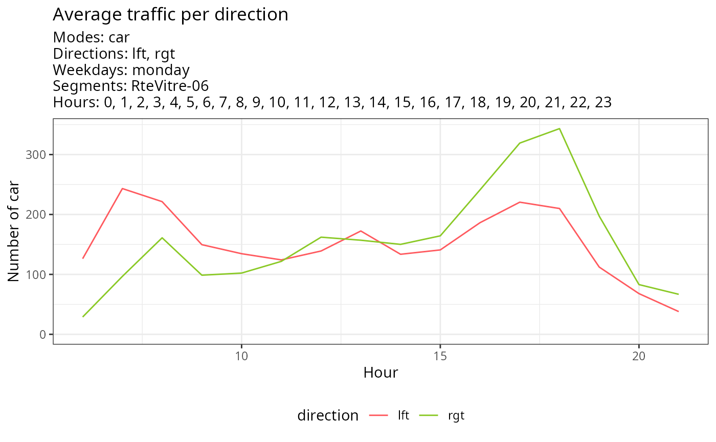
This example is typical of a route with significant commuter traffic, with heavy traffic in one direction in the morning and in the other direction in the evening.
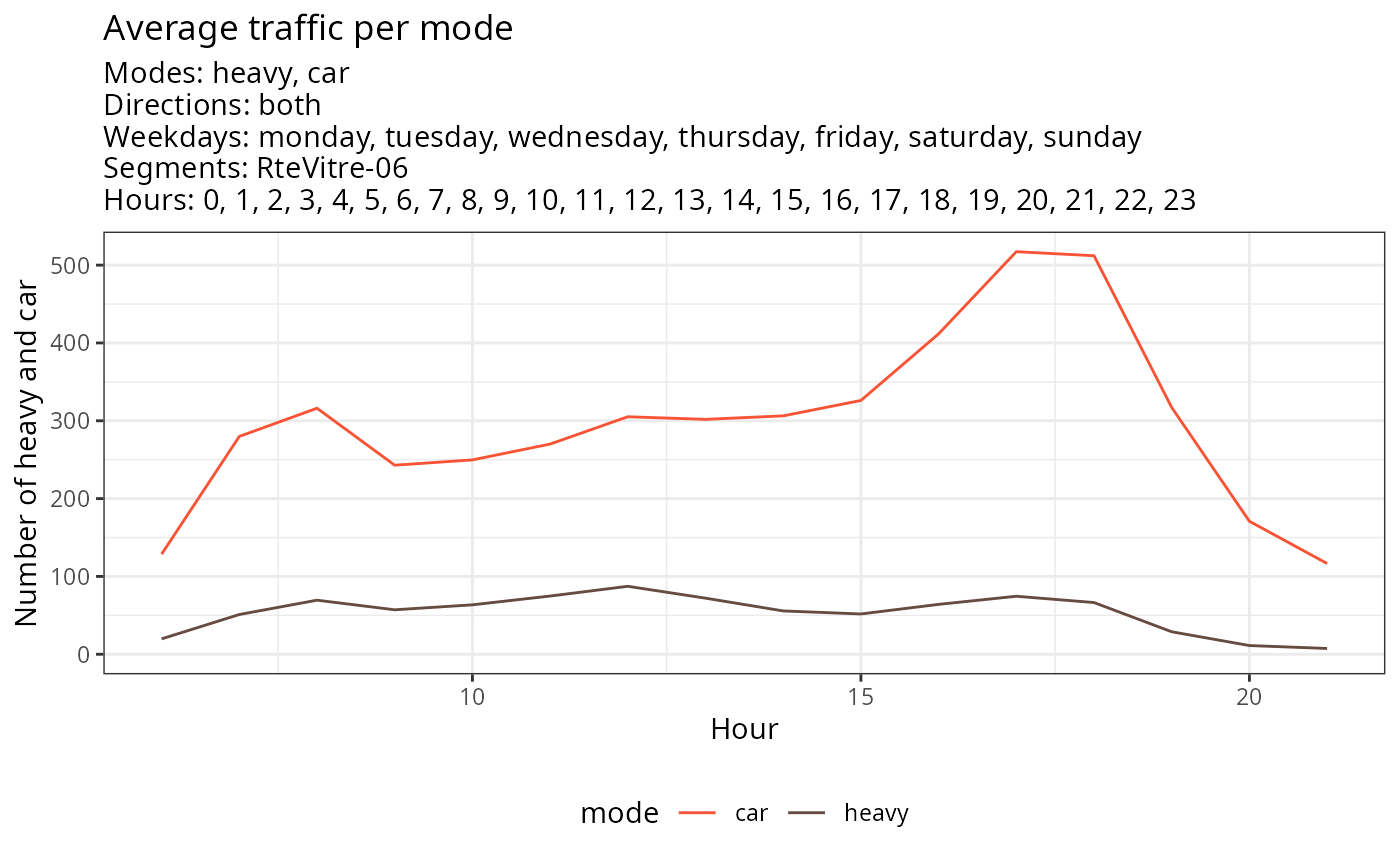
Average traffic per mode
Finally, the function gg_traffic_avg() allows for
comparing modes of transportation with each other, particularly to
observe differences in volumes or dynamics, using the parameter
aggregated_by = "direction" as shown in the example below.
As before, it’s possible to filter by directions, days of the week,
segments, hours, and of course, to select the modes of
transportation
plot(
  gg_traffic_avg(traffic,
                 aggregated_by = 'mode',
                 mode = c('heavy','car'),
                 segment = 'RteVitre-06')
)
Car speed
Telraam sensors offer speed estimation for cars on two levels :
- the estimated car speed distribution (ranging from 0 to 120+ km/h), in 10 or 5 km/h bins ;
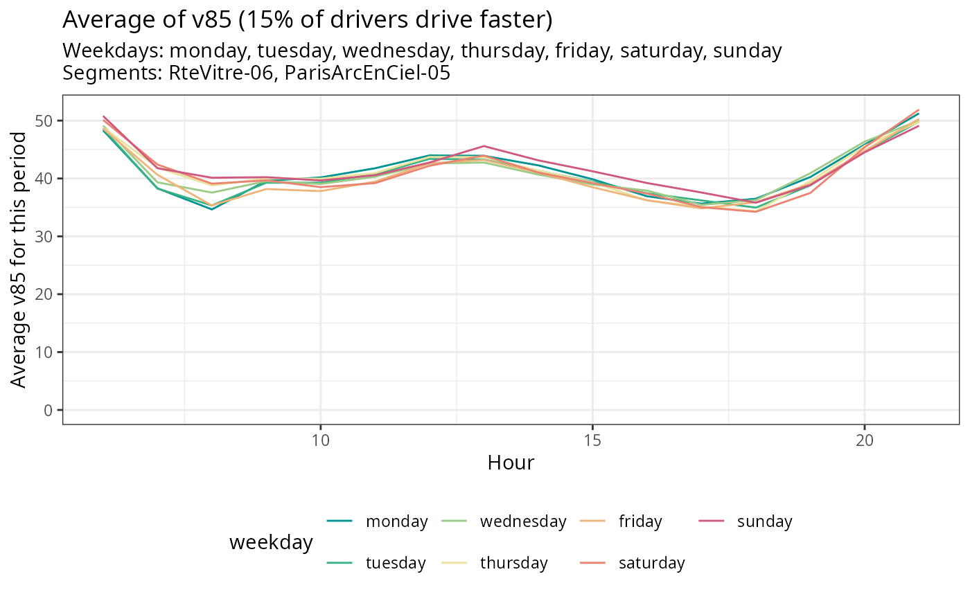
- v85, the estimated car speed limit in km/h that 85% of all cars respect. 15% of drivers drive faster than this v85 indicator.
Telraam specifies that all these speed-related measurements have biases: their accuracy is likely not better than +/- 10%. Moreover, these measurements pertain exclusively to cars and do not include other modes of transportation.
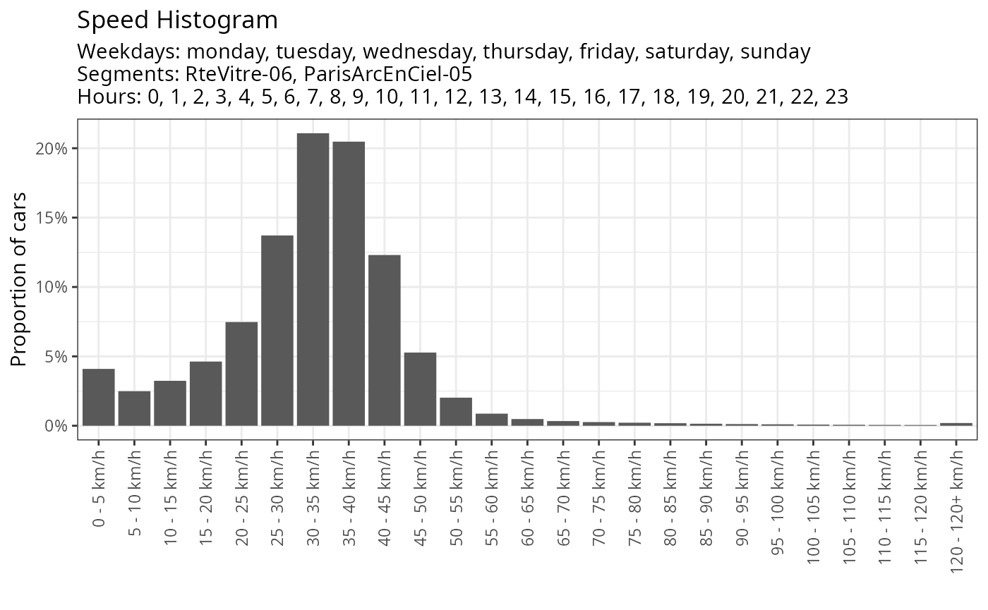
Car speed distribution
The car’s speed distribution can be plotted globally or with filters
(specific period, weekdays or segments) with the function
gg_car_speed_histogram(). Refer to documentation for more
information about filters.
plot(
  gg_car_speed_histogram(traffic)
)
This function gg_car_speed_histogram() enables you to
compare speed histograms for different segments or weekdays. Below is an
example with a distinction by road segment.
plot(
  gg_car_speed_histogram(traffic,
                         aggregated_by = 'segment_name')
)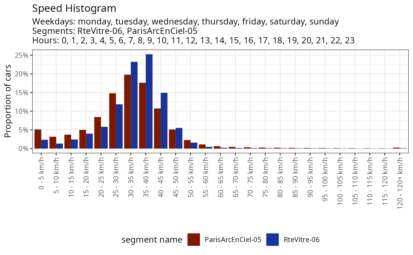
In this example, we can observe the difference between the two
segments: on the first segment (ParisArcEnCiel-05), the
speed distribution is more spread out and is characterized by a peak at
very low speeds. The second segment (RteVitre-06) has a
peak distribution in the 35-40 km/h class, with values more
concentrated around this range. During this period, 25% of cars were
driving between 35 and 40 km/h on this segment.
Here is an example by weekday with all the available filters.
plot(
  gg_car_speed_histogram(traffic,
                         weekday = c('monday','sunday'),
                         segments = 'RteVitre-06',
                         hours = 17:20,
                         aggregated_by = "weekday")
)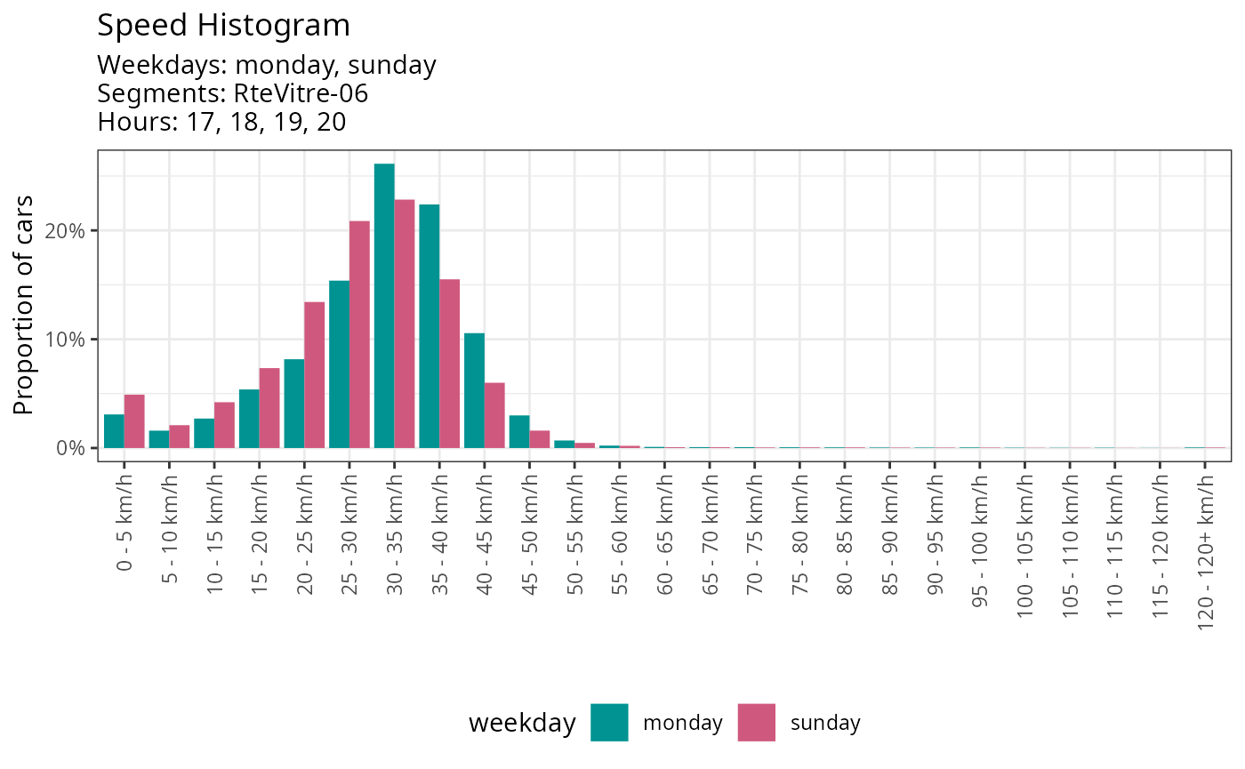
While the shift is less significant than when distinguishing between sensors, one can still notice a difference in speed between weekdays, likely attributable to the traffic dynamics differences observed earlier.
v85
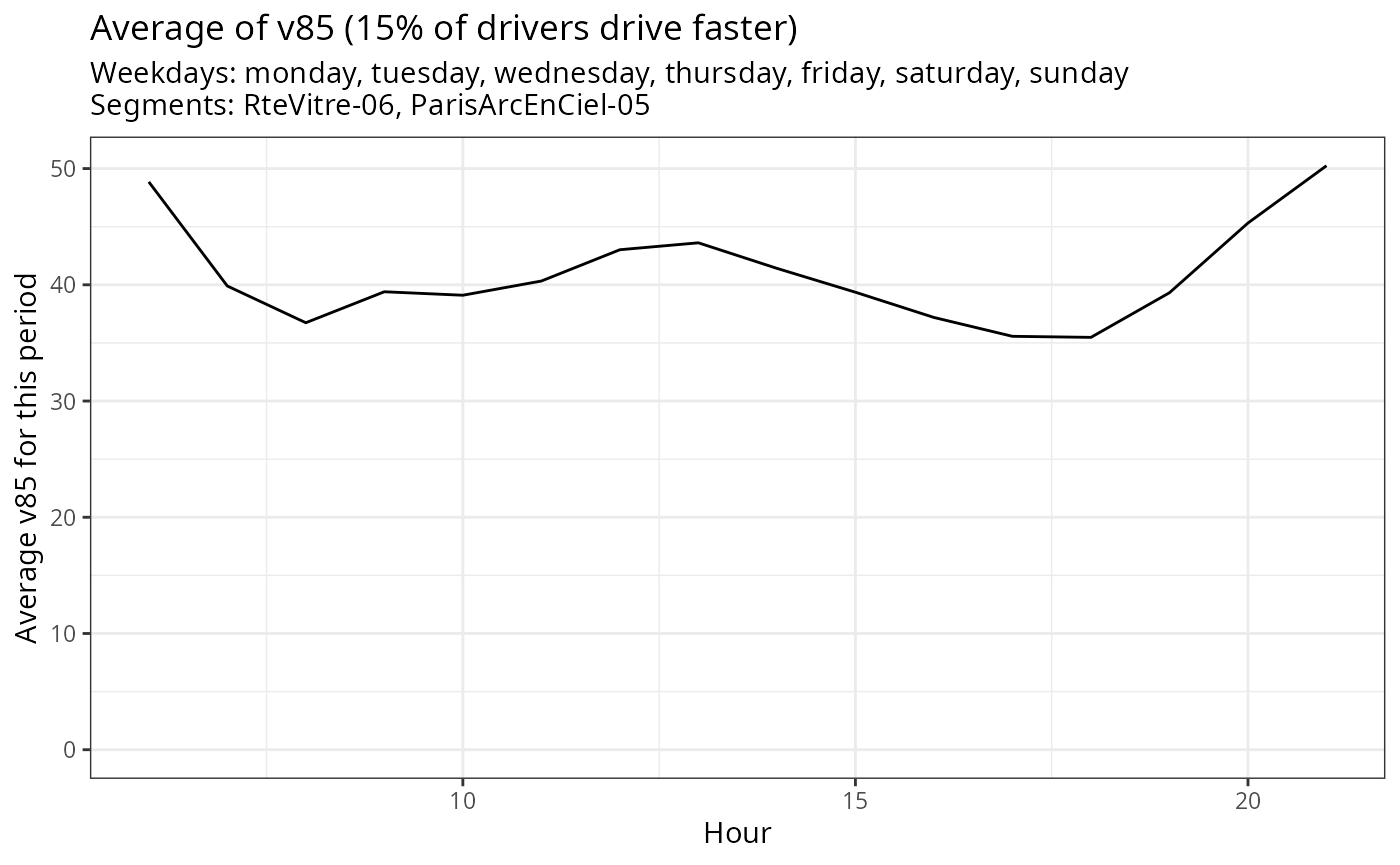
v85 is the estimated car speed limit in km/h that 85% of all cars respect. 15% of drivers drive faster than v85.
The function gg_car_speed_v85() allows plotting the
evolution of the average of this indicator according to the time of day.
This can be particularly interesting to link with traffic, to observe
possible congestion phenomena
plot(
  gg_car_speed_v85(traffic)
)
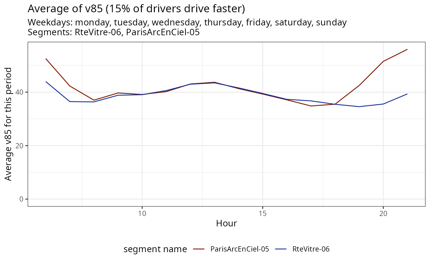
As before, it is possible to view this indicator by segment
(aggregated_by = 'segment_name') or by day of the week
(aggregated_by = 'weekday'). Here’s an example by
segment.
plot(
  gg_car_speed_v85(traffic,
                   aggregated_by = 'segment_name')
)
Finally, it is still possible to filter by a specific period or a particular segment.
plot(
  gg_car_speed_v85(traffic,
                   aggregated_by = 'weekday',
                   date_range = c('2022-01-01','2022-03-01'),
                   segments = 'RteVitre-06')
)